Overview of Current Color Trends
Bold shades are redefining interior design, showing a marked shift from muted tones. Deep blues, like navy and sapphire, provide a calming yet luxurious feel. Rich greens, such as emerald and forest green, evoke nature and tranquility. Striking reds, like crimson and scarlet, bring energy and warmth to spaces.
Deep Blues
- Navy: Adds a sophisticated elegance to living rooms and bedrooms.
- Sapphire: Works well in kitchens and bathrooms for a refreshing look.
Rich Greens
- Emerald: Perfect for accent walls and furniture, creating a lavish ambiance.
- Forest Green: Often used in home offices and studies to promote a grounded atmosphere.
Striking Reds
- Crimson: Makes dining rooms and lounges feel inviting and vibrant.
- Scarlet: Ideal for statement pieces and decor, adding a dynamic touch to any room.
These color trends are increasingly popular in both residential and commercial spaces, showing a commitment to personal expression in design.
Historical Perspective on Bold Shades
Bold colors have always played a significant role in interior design, often making a powerful statement and setting the tone for various eras.
Iconic Bold Colors of the Past
In the 1960s, vibrant colors like avocado green and harvest gold were ubiquitous. These shades symbolized optimism and forward-thinking. Moving to the 1970s, earth tones, including mustard yellow and burnt orange, dominated interiors, reflecting the decade’s natural and organic focus. The 1980s saw a dramatic shift with pop colors like neon pink and electric blue, epitomizing the flashy and extravagant culture of the time. These iconic shades each marked a distinct period, shaping the design landscape in memorable ways.
The Evolution of Bold Shades over Decades
Bold shades have continually evolved, yet their essence remains impactful. In the 1990s, jewel tones such as ruby red and sapphire blue gained popularity, adding a touch of sophistication to interiors. By the 2000s, there was a move towards more subdued but still rich tones like aubergine and peacock blue, which conveyed a mix of modernity and classic elegance. The 2010s embraced eclecticism, blending bold shades from various periods to create unique, personalized spaces. This historical evolution highlights a cyclical pattern where bold colors are rediscovered and reimagined, adapting to contemporary tastes while nodding to their historical roots.
Popular Bold Colors in Modern Interiors

Bold colors are transforming contemporary spaces. These vibrant hues add character and depth to both residential and commercial interiors.
Statement Reds
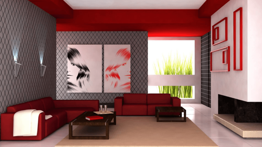
Statement reds infuse interiors with energy and warmth. Deep shades like crimson and scarlet create striking focal points that draw the eye. In living rooms, red accent walls or furniture pieces, such as armchairs, captivate attention. In kitchens, red backsplashes or cabinetry add a bold flair. The versatility of red allows it to work well with various styles, from modern to traditional.
Vibrant Blues
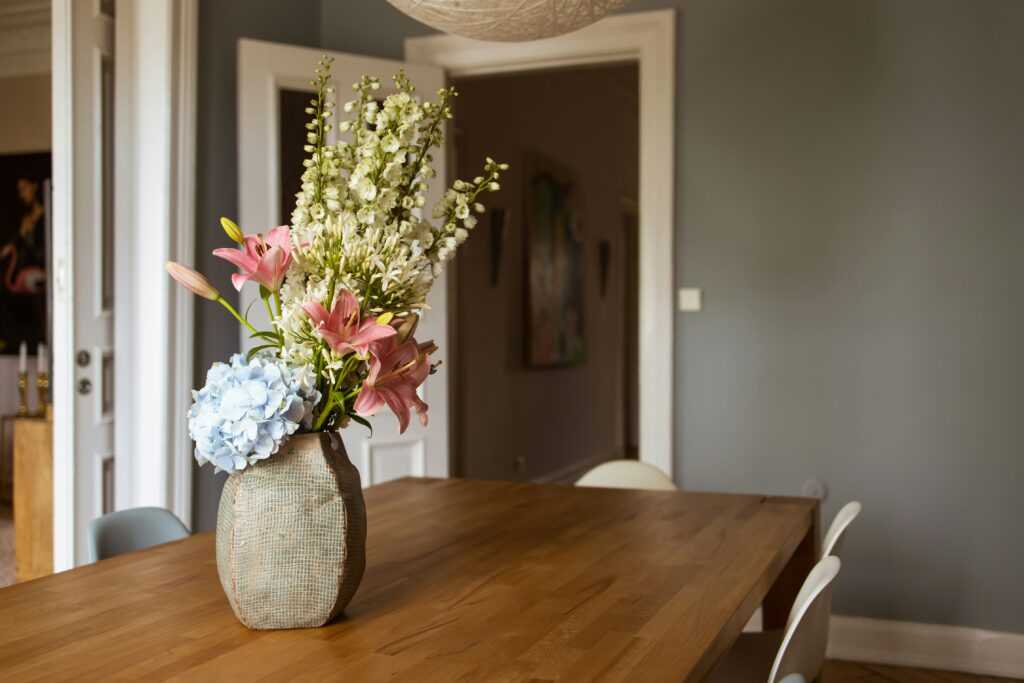
Vibrant blues offer a calming yet luxurious feel. Rich shades like navy and sapphire dominate dining rooms, bedrooms, and bathrooms, providing a serene backdrop. When paired with metallic accents, such as gold or brass, these blues evoke an air of sophistication. Designers often use blue in upholstery, creating statement sofas or chairs that anchor the room. The color’s adaptability makes it a popular choice for both contemporary and classic themes.
Energetic Yellows
Energetic yellows brighten spaces and lift the mood. Bold yellows like marigold and mustard become focal points in kitchens and living rooms. In children’s rooms, yellow walls stimulate creativity and joy. Small touches, such as yellow cushions or rugs, introduce a pop of color without overwhelming the space. Yellows pair well with neutral tones, balancing vibrancy with a sense of calm.
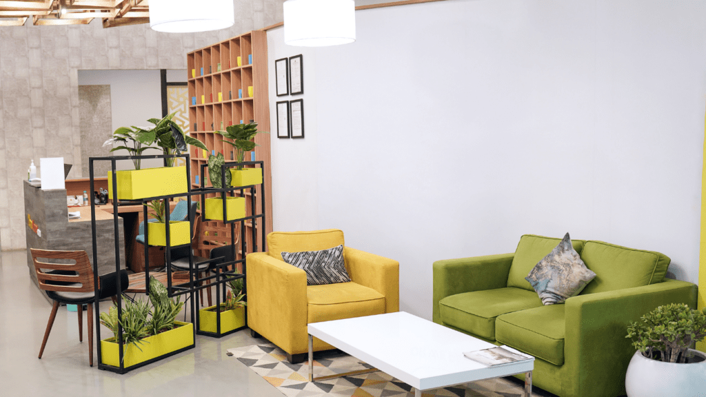
Lively Greens
Lively greens evoke nature and tranquility. Shades like emerald and forest green are popular in bedrooms and home offices, promoting relaxation and focus. In living rooms, green sofas or accent chairs bring the outdoors in. Kitchen cabinets painted in sage or olive create a fresh, inviting atmosphere. Green complements wood tones and neutral palettes, making it a versatile choice for various interior styles.
Bold Shades in Different Room Settings
Bold shades enrich various room settings, each creating a distinct atmosphere. Whether in living rooms, kitchens, or bedrooms, vibrant colors enhance design.
Living Rooms
Deep blues and rich greens transform living rooms into elegant spaces. Navy and emerald offer a sophisticated backdrop, complementing neutral furniture or metallic accents. Striking reds, like crimson, add warmth and energy, making a bold statement without overwhelming the space. Energetic yellows, such as marigold, create a lively atmosphere and work well in accents like throw pillows or artwork.
Kitchens
Kitchens benefit immensely from bold shades. Vibrant blues, like cobalt, add a touch of modernity and freshness, often used in cabinetry or backsplash tiles. Striking reds create a welcoming environment, perfect for social gatherings. Mustard yellow highlights, perhaps on a feature wall or in appliances, bring a retro yet contemporary feel. Rich greens, like forest green, evoke a sense of nature and can make kitchen spaces feel more organic.
Bedrooms
Bold colors in bedrooms create unique, personal retreats. Deep blues, such as sapphire, provide a calming and luxurious setting, ideal for restful nights. Vibrant greens, like emerald, promote tranquility and a connection to nature. Striking reds add passion and warmth, best used in moderation, perhaps in bedding or decor. Energetic yellows lift moods and can be used in accent pieces or feature walls to brighten the space without overwhelming it.
Tips for Incorporating Bold Colors
Incorporating bold colors into interior design can transform a space. Below are some practical tips to help you integrate vibrant shades seamlessly into your decor.
Balancing Bold with Neutral
Pair bold shades with neutral colors to create harmony. For instance:
- Walls: Paint an accent wall in a striking red and balance it with white or beige walls.
- Furniture: Select a deep blue sofa and complement it with light gray or cream chairs.
- Decor: Use rich green cushions on a sofa with a neutral base.
When balancing bold and neutral colors, aim for a ratio of 70% neutral to 30% bold. This ensures the bold hues stand out without overwhelming the space.
Using Accents and Accessories
Add bold colors through accessories for flexibility. Consider the following:
- Pillows: Incorporate energetic yellows or striking reds in pillow covers.
- Rugs: Choose a vibrant blue or rich green rug to anchor the room and add depth.
- Artwork: Display art pieces with bold hues to introduce color without permanent changes.
Using accents and accessories, you can easily update the look without committing to a full redesign.
 Betsylie Sheetsin – Home Renovation Expert
Betsylie Sheetsin serves as the Home Renovation Expert at Castle Shelf House, specializing in giving practical advice for both small and large-scale home improvements. With years of experience in construction and renovation, Betsylie understands the importance of blending durability with design. Her insights into home renovation projects, along with expert advice on the latest materials and techniques, empower homeowners to tackle even the most ambitious projects confidently.
Betsylie Sheetsin – Home Renovation Expert
Betsylie Sheetsin serves as the Home Renovation Expert at Castle Shelf House, specializing in giving practical advice for both small and large-scale home improvements. With years of experience in construction and renovation, Betsylie understands the importance of blending durability with design. Her insights into home renovation projects, along with expert advice on the latest materials and techniques, empower homeowners to tackle even the most ambitious projects confidently.