Why Warm Neutrals Are Trending
Warm neutrals have become the new go-to palette in interior design. Their rising popularity reflects a desire for cozy, adaptable, and timeless home environments.
Influence of Minimalism
Minimalism has reshaped interior design trends. It embraces simplicity and functionality, and warm neutrals naturally align with these principles. Soft beiges, creamy whites, and gentle taupes create a serene, uncluttered space. These shades, with their ability to open up rooms, contribute to a calming and organized atmosphere. By using warm neutrals, homeowners can easily adopt a minimalist approach, reducing visual noise and focusing on essential elements.
Versatility and Adaptability
Warm neutrals offer unmatched versatility and adaptability in interior design. These colors complement various decor styles, from rustic to modern, and can serve as both a backdrop and a focal point. For instance, a neutral-toned sofa can fit seamlessly into both a contemporary living room and a vintage-inspired space. Additionally, warm neutrals work well with different textures and materials, such as:
- wood
- metal
- textiles
enhancing their appeal across diverse aesthetic preferences.
Key Elements of Warm Neutral Palettes

Warm neutral palettes incorporate specific elements to create a cozy, inviting atmosphere in interior design. Understanding these elements is crucial for achieving the desired aesthetic.
Popular Color Choices
Warm neutrals often include shades like soft beiges, creamy whites, and gentle taupes. Soft beiges, for instance, can create a soothing backdrop, enhancing the room’s spaciousness. Creamy whites offer a timeless elegance, making spaces feel airy and light. Gentle taupes add depth without overwhelming the senses, perfectly balancing warmth and neutrality.
| Color | Characteristics |
|---|---|
| Soft Beiges | Soothing backdrop, enhances space |
| Creamy Whites | Timeless elegance, airy feeling |
| Gentle Taupes | Adds depth, balanced warmth and neutrality |
Textures and Materials
Textures and materials play a significant role in warm neutral palettes. Linen add a natural, organic feel, suitable for achieving a minimalist look. Velvet offers a touch of luxury, ideal for creating a cozy atmosphere in living rooms or bedrooms. Wood elements, such as oak or walnut, introduce warmth and texture, complementing the neutral shades perfectly. Stone, like travertine or limestone, provides a natural, earthy aesthetic that enhances the overall design. These materials, when combined, create rich, inviting spaces.
| Material | Example | Role in Warm Neutral Palette |
|---|---|---|
| Linen | Drapes, upholstery | Natural, organic feel, minimalist look |
| Velvet | Upholstery, cushions | Adds luxury, cozy atmosphere |
| Wood | Oak, walnut | Introduces warmth, texture |
| Stone | Travertine, limestone | Natural, earthy aesthetic |
How to Incorporate Warm Neutrals in Different Rooms
Using warm neutrals throughout your home enhances its atmosphere and unifies your design. Here are some strategies for specific rooms:
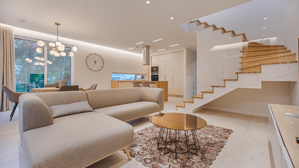
Living Room
To make a living room feel inviting, use a palette of soft beiges and creamy whites. Paint walls a creamy white to reflect light and make the room feel spacious. Incorporate soft beige sofas or armchairs to add warmth. Use textured throws and pillows in shades of taupe for depth. Wooden coffee tables or side tables complement the color scheme, adding an organic touch. Complete the look with a beige area rug to anchor the space.
Bedroom
Create a serene bedroom with gentle taupes and creamy whites. Paint the walls a gentle taupe to set a calming tone. Choose a creamy white bedspread to keep the space feeling light and airy. Add depth with taupe accent pillows and a soft beige throw at the foot of the bed. Use wooden nightstands to bring warmth and texture. Opt for linen curtains in a neutral shade to add softness and privacy.
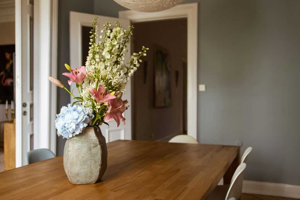
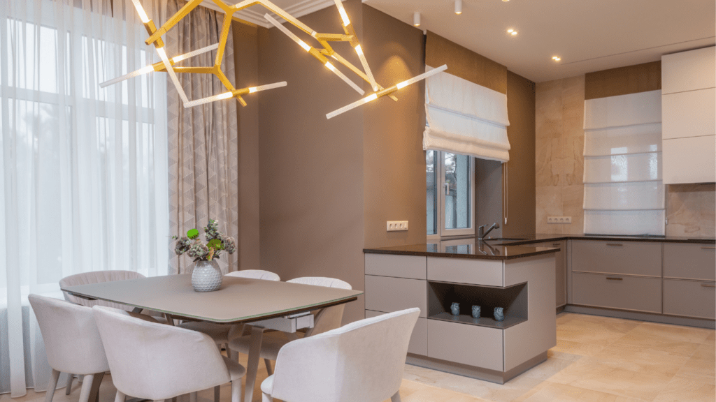
Kitchen
Infuse warmth into your kitchen using neutral tones combined with natural materials. Paint cabinets a soft beige for a welcoming feel. Pair with creamy white countertops to create a bright and clean look. Introduce wooden elements such as a butcher block island or open shelving for added warmth. Use taupe or beige backsplash tiles to tie the palette together. Add textured details like woven placemats or ceramic vases to enrich the space.
Tips for Balancing Warm Neutrals
Warm neutrals bring a unique blend of coziness and sophistication to any space. Strategic balancing ensures these colors enhance the overall design without becoming monotonous.
Combining with Bold Accents
Introduce bold accents to add contrast and interest. Use colorful cushions, artwork, or decorative accessories. Ensure the bold colors complement the warm neutrals, like deep blues or rich greens with soft beiges. This approach helps maintain visual interest and prevents the space from looking too subdued.
Layering Textures
Layering textures enriches the overall aesthetic. Incorporate various materials such as linen, velvet, wood, and stone. These elements add depth and appeal to the space. Combine a linen sofa with velvet cushions or a wooden coffee table with stone decor. This textural variation enhances the warmth and coziness of the neutral palette, making the space feel more dynamic and inviting.
 Wesleyero McGill – Founder & CEO
Wesleyero McGill is the visionary behind Castle Shelf House, bringing over a decade of experience in home renovation and design. His passion for creating beautiful, functional spaces has led him to establish this platform, where he shares the latest trends in interior and exterior design. As Founder and CEO, Wesleyero is dedicated to offering expert advice on furniture placement, home styling, and renovation, helping homeowners transform their spaces with ease and confidence.
Wesleyero McGill – Founder & CEO
Wesleyero McGill is the visionary behind Castle Shelf House, bringing over a decade of experience in home renovation and design. His passion for creating beautiful, functional spaces has led him to establish this platform, where he shares the latest trends in interior and exterior design. As Founder and CEO, Wesleyero is dedicated to offering expert advice on furniture placement, home styling, and renovation, helping homeowners transform their spaces with ease and confidence.